
Appsuite Restaurant CRM
Redesign a restaurant menu/ordering/rewards/marketing software interface for both mobile and web.

Role: UX Designer + Researcher; UI Support
Scope: Redesign the customer-facing software of Appsuite’s restaurant menu/online ordering/customer rewards/marketing software for both web and mobile app
Process: Empathize - Marketing + competitor research, heuristic evaluation, user interviews; Define - Product roadmap, sitemap, UI requirements; Ideate - Task + user flows, responsive mid-fidelity wires; Test - High-fidelity prototype, usability testing
Project Background
After two decades as a leader in the restaurant CRM space, Appsuite was facing a problem - while they continually updated the functionality and usability of their software features, they never considered the experience of their customers, nor updated the software aesthetic in just as long. This made their product look cheap, untrustworthy, and unappealing to new customers who had many user-friendly options.
Appsuite came to us to redesign their system with an emphasis on user experience and modern UI, which is also mobile responsive and ADA compliant.
Objectives
Redesign the user-flow and functionality of features.
Design the front-end interface of the software.
Create designs for both web and mobile app uses.
Designs must be modular and customizable by customers.
Additionally, I redesigned the company website to better reflect their product offerings, use cases, and new branding. View the company website here.
01. EMPATHIZE
Secondary Research
Market Research for Appsuite was really informative, despite being less “cool” than market leaders, they had the most robust all-in-one system while competitors focused on one or two core features. However, to understand how to better position Appsuite in this market I dug deep into understanding the key demographics and insights coming from the restaurant industry.
Consumer statistics
35% of customers who use mobile payments are between the ages of 25-34.
78% of millennials would rather spend money on food than on purchasing an item.
Guests are more likely to order from a restaurant website than a third party service.
44% of diners use mobile apps to place orders.
51% of customers view a menu before picking a restaurant.
Customers ranked speed as the number one factor of a good online order above all.
Between 62% and 88% of customers use a credit/debit card for their purchase.
14% of diners consider themselves brand loyal; 25% of customers said a loyalty program was very important to their guest experience.
31% of customers are open to receiving emails once a week; 87% said they were excited to hear about specials and discounts.
Market research
52% of restaurants name high operating costs and food as their top challenge.
80% of restaurateurs say that implementing technology increased their efficiency.
Digital channel sales are on pace to reach 30% of total sales for US restaurants by 2025.
60% of U.S. consumers order delivery or takeout once a week.
34% of consumers spend at least $50 per order when ordering food online.
20% of consumers say they spend more on off-premise orders compared to a regular dine-in experience.
Digital ordering and delivery have grown 300% faster than dine-in traffic since 2014.
70% of consumers say they’d rather order directly from a restaurant.
45% of consumers say that offering mobile ordering or loyalty programs would encourage them to use online ordering services more often.
Competitive Analysis
To determine how Appsuite compared to competitors, I conducted a Competitive Analysis on their strengths and weaknesses. This allowed me to discover areas of familiarity as well as opportunities to improve the customer experience.

Primary Research
Next, I conducted User Interviews with Appsuite customers; restaurant owners and managers, as well as two people who were customers of competing products. Upon completion of the interviews, the top needs/desires were selected as were their top pain points
Participants
4 owners and 2 managers.
All six were men.
Between the ages of 33 and 60.
They came from a range of restaurant types.
Needs/Desires:
Intuitive UI that they could set up and modify easily.
Consistency and cohesion between their web and mobile applications.
Customizability/modularity in their mobile apps.
Pain points:
UI with too many clicks or too much digging to find a feature they’re looking for.
Overcomplicated rewards programs or gift card purchase/usage.
Having an inconsistent and/or hacked together website/menu/ordering system.
02. DEFINE
User Persona
Working with Appsuite, our marketing team, and using the research conducted, I devised 3 User Personas that made up the types of customers that both sought out a solution like Appsuite CRM and were also the company’s “ideal customer.”
Small business owner Mary: Age 43. Owns 6 franchise operations and is actively seeking a loyalty program that fits her restaurants. She’s not technically savvy but knows she needs an advanced solution to help her streamline and scale her customer frequency.
Marketing team member Joe: Age 31. Is tasked with finding a customer-facing app for the business. He does extensive research on all the solutions available and is concerned with presenting his CEO with a solution that has the best ROI to features. He’s knowledgeable of the space and in all the tools and integrations available.
New Oracle customer Steve: Age 57. Owns 20 franchises and has committed to using an Oracle POS solution in his stores. Despite this, he’s looking for a CRM that offers delivery/driver solutions that can scale with his business. He’s all about the bottom line and wants relatively hands-off operation.
Despite the personas being pre-defined in a sense, we were able to both validated and disprove certain assumptions made with the research conducted.
Product Roadmap
Considering the many parts of this project that all needed to be designed, developed, and tested - the Product Roadmap needed to be thorough in its prioritization of features. This project began just as the Covid 2019 pandemic was taking hold, so early in the project, the roadmap had to be adjusted to account for urgent needs surrounding contactless and curbside pickups.
View the full Product Roadmap here.
Sitemap /App Map
With the product roadmap laid out and all research and heuristic evaluations conducted, I created a Sitemap for the desktop app and an App Map for the mobile application. Both had core features that they shared but also features unique to their use cases and technical abilities.
03. IDEATE
Sketching
We opted to take a mobile-first approach to this project as the app has a more nuanced and complicated flow. I started Sketching some key screens to help direct the general layout and foundational elements for the screens, as well as put down some ideas for the many flows that needed to be considered.
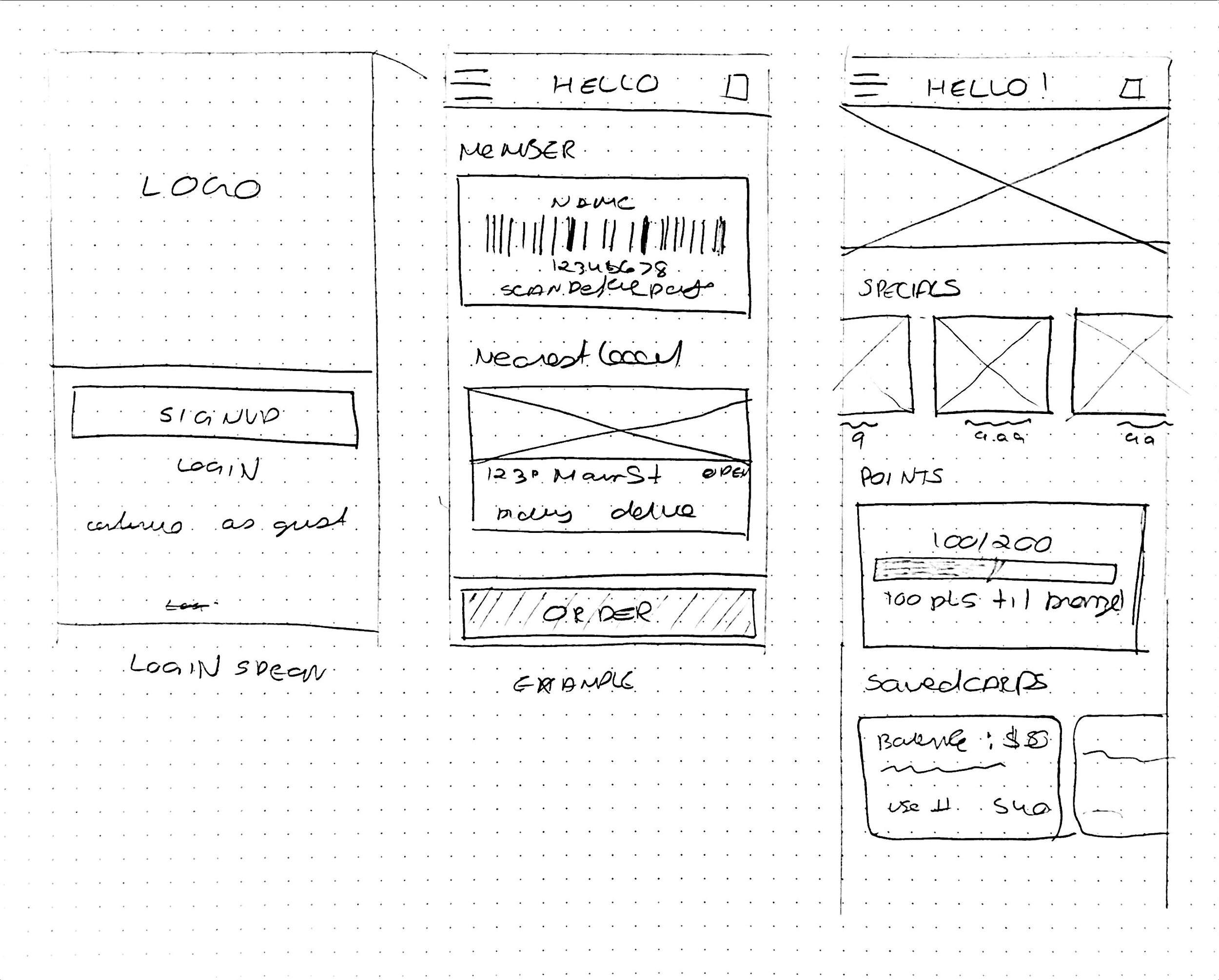
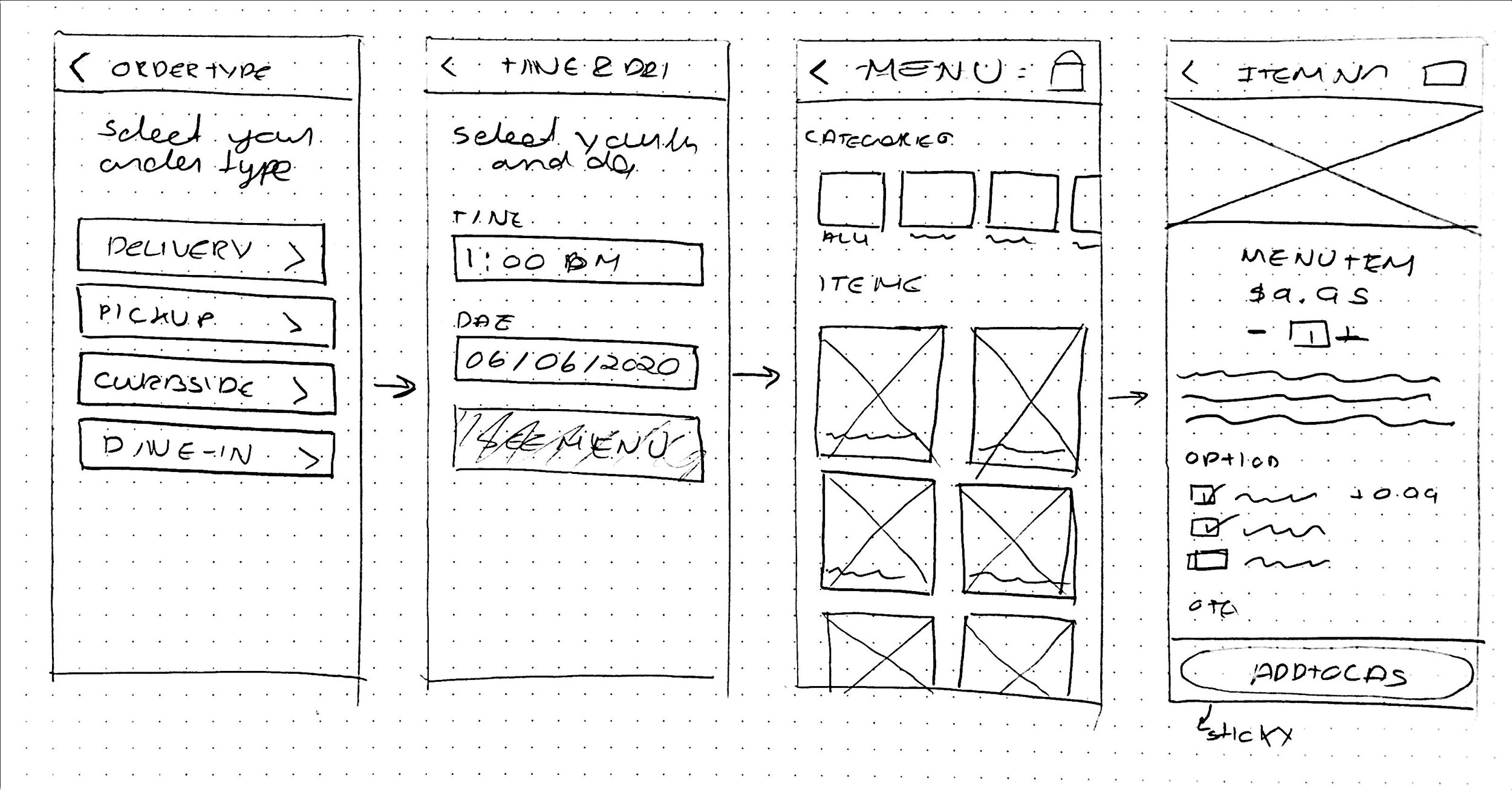
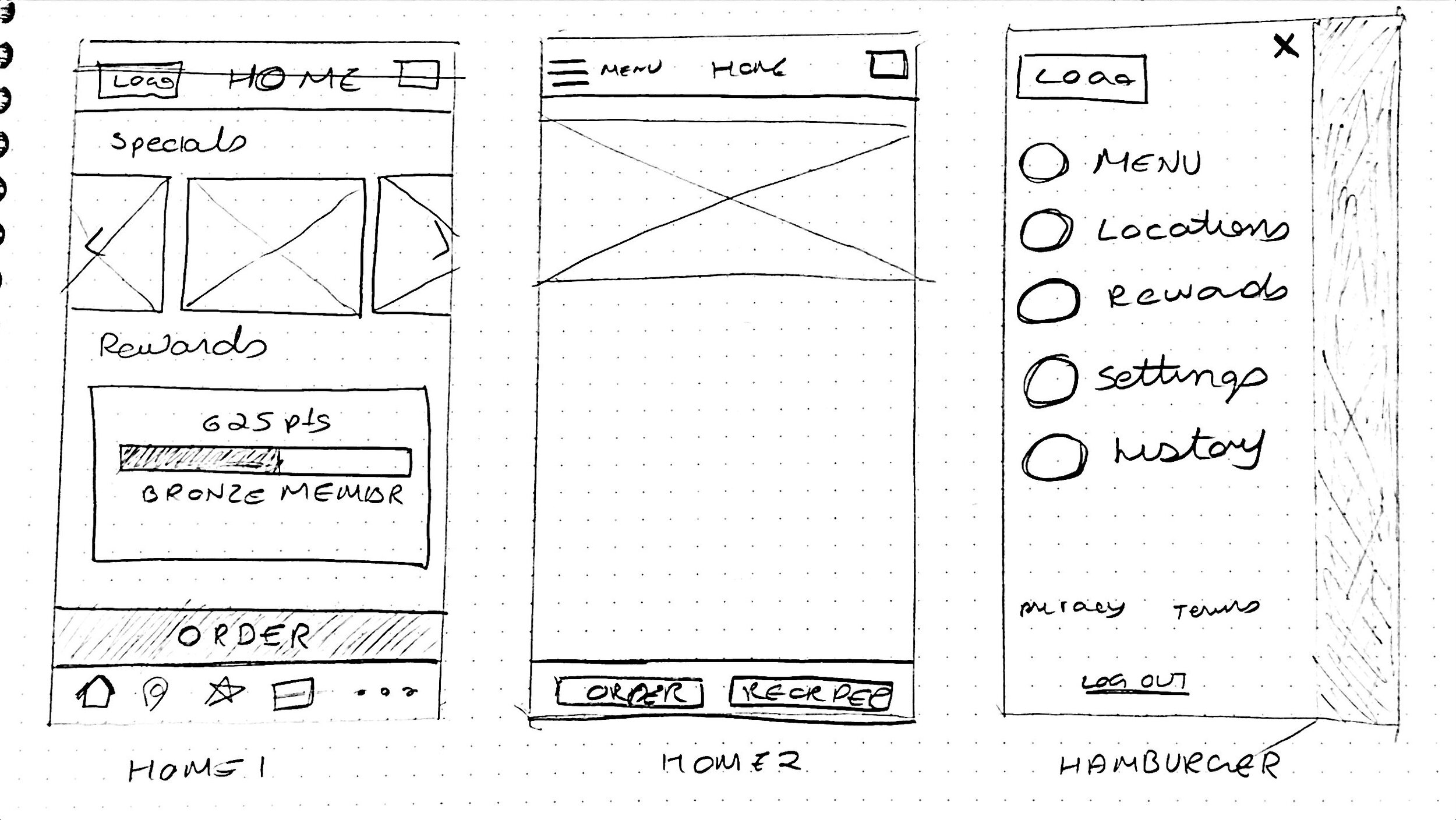
Mid-Fidelity Frames
After sketching, I created mid-fidelity wireframes of the pages as laid out in the Sitemap, and the mobile app versions as laid out in the App map. These were created with the various flows in mind, but also to make prototyping easier. Some of the mobile screens are viewable below.
View all Mid-fidelity app wireframes here.
Desktop app wireframes were also created and can be viewed here.
04. PROTOTYPE + TESTING
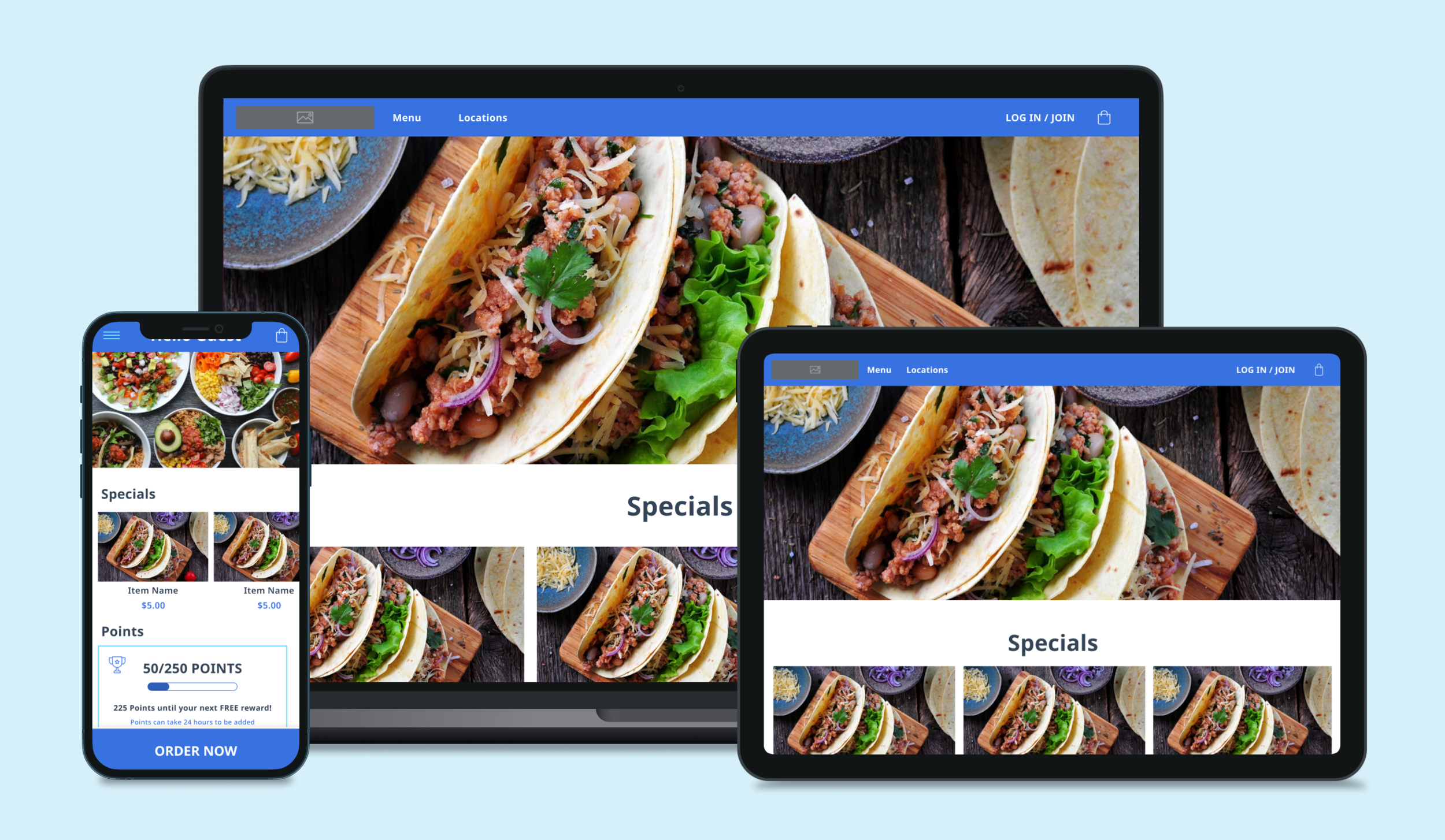
High-Fidelity Prototype
I worked with our design team to design a High-fidelity Prototype from an aesthetic that evolved over the course of this project. It was intentionally kept very similar to the mid-fidelity design as the default aesthetic of the software is meant to act as a template for hospitality partners to build on.
Prototypes were created for both the Mobile App (viewable here), as well as for Desktop (viewable here).
Below I highlight what the curbside pickup flow looks like as a template - as well as a version from a partner restaurant, whose app I designed concurrently.
Testing
Testing took place with the original group I interviewed, as well as a handful of “customers” who ran through a series of tasks to test the usability and intuitiveness of the app. This testing took place separately with the partner restaurants app as well and aided in further refining the app.
Some revisions that were made:
Accounting for restaurants that don’t have menu images.
Adjusting ordering flows to account for different menu items at franchises - bringing order type to the front of the flow remedied this.
Tweaking the options available in catering orders to be more customizable to the menu and restaurant.
Changing the way upsells like sides and drinks are added to “combo meals” work, by adding them as line items instead of bundles due to a nuance of Appsuites backend.
05. REFLECTION
Summary/Reflection
As of January 2021, the software is launched in a sort of beta program with existing Appsuite customers slowly being offered the new software. Working with our UI designer, I helped design 3 design templates (colorways essentially) for the app so that brand new customers could get up and running by simply picking a theme.
In hindsight, some things that I would have done differently:
Insisted on sticking to the Product Roadmap: Parts of the project languished as we fast-tracked features in the wake of restaurant closures in early-2020. Rushing did not create better results and in fact, only delayed much of the project. While I was able to get everything done get things back on track, our timeline and scope were blown up and damaged the relationship with the client who could not keep up with their own internal timelines.
Gotten everyone on the same page about how the software works: Some parts of the design process created confusion for everyone when it became clear that we all had different understandings of how the software work. An all-in-one solution is very broad and everyone from stakeholders, to developers, to clients, to designers all have different relationships to it. What’s obvious to one group is virtually unknown to others - had we taken the time to all get on the same page, we would’ve had better communication of expectations and designed a stronger set of features.