

UX/UI Design + Branding
Kaus Insurance
Insurance that’s everything you need, and nothing that you don’t.

ROLE
UX/UI Designer, with mentor and peer reviewing.
TIMELINE
80 hours over 2 weeks, with time spent revising.
This is a speculative project.
PROJECT BRIEFING
Kaus has been in the insurance business for over 30 years offering basically every kind of insurance. Up til now they’ve sold their products directly to customers in packages. But with the rise of the internet and the awareness that a younger demographic does their research and shopping online, Kaus is looking to extend their reach with a fully responsive, user friendly website.
They’re also looking to do a brand refresh that takes them away from their stuffy past and appeals to a newer, younger customer.
OBJECTIVES
To create a mobile responsive e-commerce website for Kaus customers.
To update the Kaus brand and logo to appeal to a younger demographic.
For the site to be intuitive and easily navigable between product options.
1. RESEARCH
SECONDARY RESEARCH
I conducted initial Market Research to get an understanding of the insurance market, both as a whole and specifically when it came to companies that conducted a majority (or all) of their business online. This researched gave me insight into understanding how to think about insurance products and how to view customers of these products.
Some key insights:
40% of all premiums are in health insurance, 30% in life insurance, and 25% in casualty and property insurance.
70% of all insurance providers have moved their businesses to the internet.
Newer insurance companies tend to niche down into providing just one type of insurance.
Most people get health insurance through their employer.
- “Insurance packages” with minor customization seems to be an emerging trend, over complicated and overly nuanced payment plans.
Property and casualty insurance has seen massive growth in 2018; Net income doubled to over $34B
Life insurance and annuity went down by 12%
I also conducted a Competitive Analysis, which was pretty straight forward considering insurance has existed as long people have had valuable things to insure, and there were a great many direct and indirect competitors to analyze and compare with. This research allowed me to understand how other companies are solving some of the problems that exist in the market right now. It was also interesting to learn how the niche providers differed from the large-offering providers, and how Kaus could could position itself amongst these companies to ultimately provide excellent service to their customers.
View market and competitive research here.
PRIMARY RESEARCH
With market and competitive research under my arm, the next step of my research involved conducting 1-on-1 Contextual Inquiry Interviews with potential customers. I spoke in-depth to five people, aged 32-36, and collected qualitative data on their pain points, wants, needs, and behaviors when it came to purchasing insurance. My goal was to understand:
How the customer tends to purchase their insurance.
What their experience was like if they purchased insurance online.
Identifying the paints points involved in the process of buying insurance, and in using their insurance.
What some of their positive and negative experiences have been with their insurance providers.
View interview script here
Upon completing these interviews, I took what I learned and synthesized my findings into categories of goals, needs, frustrations, and motivations.
View Interview Briefing here
2. RESEARCH SYNTHESIS
EMPATHY MAP
Next, I took the data I uncovered from user interviews and constructed an Empathy Map in order to identify patterns that emerged between different people. This allowed me to keep a human-centric view of the product as I further understood it’s potential users.
I distilled key insights from the categories that emerged from the patterns, and identified needs based on those insights, as follows:
INSIGHTS
There’s little patience for technology that doesn’t work as expected.
They want to feel like they’re getting their money's worth.
Unexpected changes were unwelcome.
NEEDS
Customers need their plans to be accessible.
Customers need their plans to fit their budget.
Customers need to be able to trust their insurance providers.
USER PERSONA
After identifying those insights and needs, I was able to create a fictional User Persona to represent what the ideal customer of Kaus’ insurance would look like. Giving the data an identity with context and personality, helps in empathizing with the user while building the product.
STORYBOARD
To take this a step further I created a Storyboard that highlighted and instance of a user being frustrated with their insurance after an accident and how it differs when dealing with it as a Kaus customer.
3. DEFINE / IDEATE / STRATEGIZE
PRODUCT GOALS
Before approaching the task of creating solutions for the above persona and addressing their pain points with a website and features, I found it helpful to combine the project goals, as defined in the project briefing, with the user goals as defined by research and taking a look at how they overlap with each other.
FEATURES ROADMAP
With the project goals defined, I was able to create a Features Roadmap that listed all of the different features that would satisfy the business and customer needs - ranked in order of priority based on development time and cost.
View features roadmap here
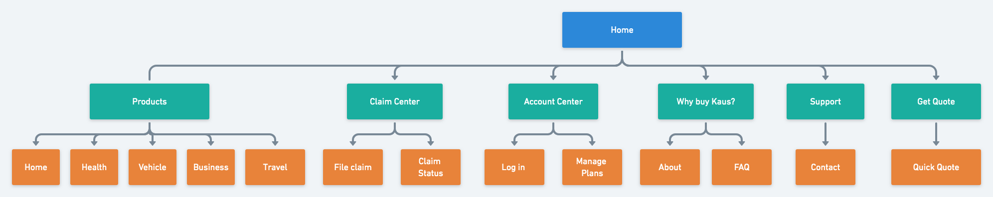
SITEMAP
Everything I learned from the product goals, features roadmap, and card sorting results went into creating the Sitemap for the new Kaus site. I included the various proposed web pages and structured them in such a way that helped me visualize what the eventual site would look like and how the basic navigation would be.
4. INTERACTION DESIGN
USER AND TASK FLOW
With the site map charted out I moved on to the initial stages of prototyping by creating a Task Flow and a User Flow.
The task flow I devised showed the direct path between a customer finding the Kaus home page and checking out having purchased an insurance product.

Building on this, the user flow I devised followed the path a user might take to view their claim center - either to review existing claims or file a new one, and accounts for the various screens a user will encounter.

UI REQUIREMENTS
Using these flows and the and the features roadmap from earlier, I created a UI Requirements document that listed out the exact pages that I would need to build and all the elements to include on them.
View UI requirements document here
LOW FIDELITY
With the pages and their elements defined, I moved onto designing the page. However, before going digital, I created low fidelity sketches of potential homepage layouts in Sketch as a way to visualize different design directions before committing to any particular design patterns.

I then created mid-fidelity sketches of three pages - the home page, a product page, and the quote process - as a way to get a feel for how the digital layout might look.

RESPONSIVE WIREFRAMES
And then I created Responsive Wireframes as a way to see how the homepage would look on different devices including desktop, tablet and mobile. This effectively became the starting point for the pages I would go on to build next.

I continued by creating mid-fidelity prototypes in InVision to create interactive wireframes that allowed me to see the basic site in action and discover any major issues before moving onto add more visual elements.

5. USER INTERFACE DESIGN
BRAND LOGO
It was easy to get a bit over complicated with the colors and concepts as it related to those adjectives. But, in the end I was able to narrow down my Logo choice by creating something that was on par for the industry but still pretty modern and appealing to a younger crowd. The final logo was a word-mark of ‘Kaus’ with a stylized U taking the shape of a shield.
View logo variations here
STYLE TILE
Using the inspiration I collected on a mood board, I put together a Style Tile that defined the final colors, fonts, and other elements that would make up the visual look of the final site.

RESPONSIVE UI
With the UI elements finalized, I started to build a High-fidelity prototype of the Kaus website. First by creating Responsive UI versions of the desktop, tablet, and mobile sites. And then, by building out the remaining pages of the desktop version of the site.
UI KIT
I prepared a UI Kit using the elements I included on the Responsive UI. It was the starting guide that I used to guide the visual design of further pages.
View UI Kit here
6. USABILITY TESTING & ITERATING
USER TESTING
The first steps to my testing process involved determining the participants of the test, the methodologies, scripts, tasks to test, the goals of the test, and the error and completion rates.
View Usability Test Plan here
I conducted my interviews in-person at a local coffee shop. I tried to get a wide range of people to test the prototype, because even though Kaus has a user base in mind - different types of people would be using the site. I ended up with 6 total participants - 5 in person, and 1 remote tester.
I had the users narrate what they were doing as they ran through the tasks, as well as provide their impressions of the site and compare it to what they know of insurance site (when applicable).
I took their feedback and put it into findings document that summarized everything I learned from user feedback.
View Test Findings here
AFFINITY MAP
I then took this feedback and organized it into categories of - success, patterns, and, comments- that I further organized on an Affinity Map, where I further distilled my findings into insights and recommendations to make revisions to the prototype.
The recommendations I uncovered are as follows:
INSIGHTS
Although users like the minimal aesthetic, they want to see more visual direction on the site.
Users wanted to be able to learn more about what they were buying, even though there was just one task flow.
Users want to see more detailed pages at the end of tasks.
RECOMMENDATIONS (HIGHT TO LOW PRIORITY)
Add more icons to make actions more clear.
Add information pages for insurance products
Add progress bar to quote process.
Add chat support to pages.
REVISIONS
Using the recommendations from the affinity map, I set about updating my high-fidelity prototype with all the new features that were of highest priority.

With revisions complete, I then updated the UI kit to account for all the elements and adjustments I implemented. This kit will go out to inform any future updates to pages, as well as be modified when/if any new elements are added.
7. REFLECTION
TAKEAWAYS
Don’t reinvent the wheel
I learned a lot when it came to following industry standards and design patterns. I got stuck trying to be original or creative in a few instances, and it only complicated my work in all sorts of ways. Learning to simplify and that “perfect is the enemy of done” were vital realizations in later stages especially.
Research, research, and more research
If I could have had more time with any aspect of this project, it would’ve been the research. Especially when it came to interviewing and the initial discovery stages. In hindsight, I’ve come to realize a lot and have a much better understanding on how to plan this part of the process and am much more confident in running interviews and extracting insights from data.
Usability testing uncovers a lot
It was vital to get a variety of users to test out my prototypes. It really thwarted some assumptions I made about what was best for user friendliness. This was especially true when it came to an insurance product - people are used to stuffy experiences, but it was clear that this wasn’t a preference. When given a taste of personality and visual direction, it won out as a preference.